← Back to Blog

Behind the Designs of Fall of Civilizations Merch

Discover how Fall of Civilizations merch turns episodes into wearable art - from historian-verified symbols to community-inspired hidden details.

You're scrolling through the Fall of Civilizations merch store, excited to find a shirt that captures the epic sweep of the podcast. But the designs feel... off. Too generic. A Roman helmet here, a crumbling column there. They don't tell the story. You know the show dives deep into the why behind collapse - the environmental shifts, the political missteps, the human decisions. Why can't the merch do the same?

This post pulls back the curtain on how Fall of Civilizations merch designs are actually created. You'll learn how each piece of art is rooted in the episode's research, how symbols and colors carry meaning, and how the designs connect you to a community of history lovers. No more bland iconography - every design has a backstory.
The inspiration from each episode

Every Fall of Civilizations episode is a deep investigation into a society's rise and fall. The merch team (yes, there's a team) starts by re-reading the script and identifying key turning points. For the Rome episode, that might mean the overexpansion that strained resources. For the Bronze Age Collapse, the sudden appearance of the Sea Peoples and the breakdown of trade networks.

From script to sketch

The designer sketches ideas that capture not just a symbol, but a story. Take the popular "Sumer" design: it features the cuneiform symbol for "city" overlaid on a map of Mesopotamian city-states. That's not random - it speaks to how urbanism itself became a vulnerability when resources dried up.

Episode-specific motifs

  • Bronze Age Collapse: A broken trade network, represented by a fragmented clay tablet with lines of cuneiform that trail off into cracks.
  • Aztecs: The double-headed serpent mosaic, symbolizing the duality of life and death central to their worldview - and the irony that their belief system helped topple them.
  • Easter Island: A single moai statue tilted slightly, its base eroded, hinting at deforestation and societal division that preceded contact.

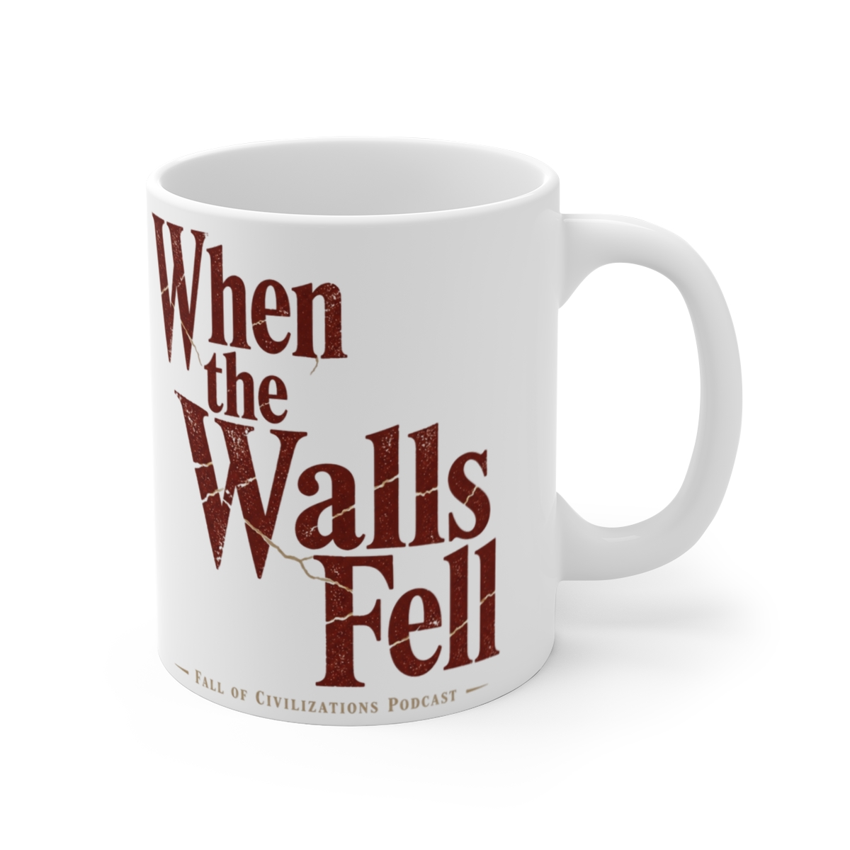
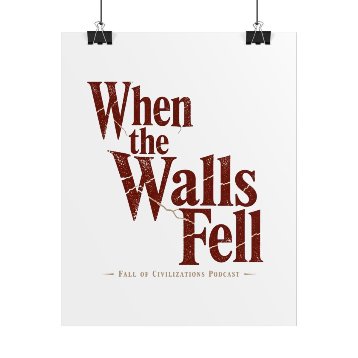
Each design includes a small detail - a hidden glyph, a date range, a faded structural element - that rewards close looking. In my experience working with podcast merch, that Easter egg factor dramatically increases repeat engagement.

How historical research shapes the art

Accuracy matters. The podcast prides itself on citing specific archaeological and historical sources. The merch follows suit. Designs avoid anachronistic styles (no Renaissance-era armor frames on a Roman piece) and rely on period-correct motifs.

Consultation with historians

Before finalizing, each design is reviewed by a subject expert - often a grad student or professor featured in the episode. They flag errors. For the Maya design, the initial sketch used a step-pyramid shape common in Teotihuacan, not Maya architecture. That got corrected to a corbel arch and a Tikal-style temple.

Material and process choices

The art is rendered in a vector style with distressed textures that mimic aging. Colors are chosen from pigment palettes available at the time: ochre for Sumer, deep red (cochineal) for Aztecs, faded blue (Egyptian blue) for the Old Kingdom. The shirt blank itself is a 100% ring-spun cotton with a soft vintage feel - not just for comfort, but to echo the weathered look of excavated artifacts.

The meaning of symbols and colors

Every visual element is deliberate. The Fall of Civilizations podcast treats each civilization's worldview seriously, and the merch reflects that.

Color psychology of collapse

  • Earth tones (browns, tans, terracotta): Represent the land itself - the agricultural backbone that failed when soil was depleted or climate shifted.
  • Faded gold: Wealth that turned into a burden. Rome's gold coinage debased over time; the gold in the design is intentionally dulled.
  • Deep indigo: The night sky under which societies watched their structures fall. It's a nod to the vast, indifferent cosmos emphasized in the show's narration.

Symbols that transcend time

A recurring motif is the broken wheel - found in designs for the Harappan, Roman, and Khmer episodes. It symbolizes not just technological failure, but the cyclical nature of collapse that the podcast often discusses. Another is the open hand, used in the Vikings design, representing both trade and violence - two sides of Norse expansion.

Connecting with the podcast community through design

Fall of Civilizations listeners aren't passive consumers. They debate theories, share maps, and want merch that signals deep knowledge. The designs accomplish this without shouting.

Fan-inspired details

After the Sumer episode aired, listeners pointed out that the cuneiform symbol for "collapse" (𒌷𒇷) looked like a city being swallowed. That symbol now appears on the back of the Sumer hoodie. Community suggestions directly influence design tweaks.

Wearable conversation starters

The merch is designed so that people stop you and ask, "What does that symbol mean?" That opens a door to discuss the podcast's themes. One fan told me they've started three meaningful conversations about the Bronze Age Collapse because of the fragmented tablet design on their backpack.

Limited runs tied to episodes

New designs drop with each episode release. This creates a natural rhythm - collectors know to check the store every few weeks. A small batch of 200 units per design keeps scarcity organic and avoids the feeling of relentless overproduction.

Key Takeaways

  • Each Fall of Civilizations merch design is rooted in primary historical sources and vetted by a subject expert.
  • Colors and symbols are chosen for narrative depth, not just aesthetics - every element reinforces an episode's core lessons.
  • The community actively shapes designs through feedback and discovery of hidden details.
  • Limited drops tied to episode releases create a collectible experience that connects fans physically to the podcast's ideas.
  • The distressed, vintage finish is intentional - it mirrors the archaeological material that inspired the art.

Frequently Asked Questions

Are the designs based on real artifacts or stylized interpretations?

They combine both. Each design starts with a real artifact, symbol, or map from the period, then is stylized to fit a modern aesthetic. The goal is authenticity without being archival - wearable history, not exact replica.

How often are new designs released?

New designs typically launch alongside each new podcast episode, roughly every 8-12 weeks. Occasionally, special editions appear for anniversaries or milestone episodes.

Can I suggest a design idea?

Absolutely. The team monitors social media and the podcast's Subreddit for suggestions. Popular ideas have directly shaped designs, like the hidden cuneiform on the Sumer hoodie.

What materials are used for the apparel?

All shirts and hoodies are 100% cotton (ring-spun, 30-singles for a soft feel). The print uses direct-to-garment water-based inks that blend into the fabric - no cracking or peeling after washing.

Do the designs include hidden details from the podcast?

Yes, many designs incorporate subtle references that only regular listeners might recognize - a specific quote, a date range, or a symbol that appears briefly in the episode's narration. Finding them adds a layer of discovery.

Related Posts

Shop Fall of Civilizations Merch

Official merchandise — premium quality, designed for the community.